1. Getting started
1.1 Fork the starter app
The first step is to fork the starter application on Codesandbox. The starter has all the packages we will need already added and configured.
Make sure you are signed into Codesandbox and go to the following URL:
https://codesandbox.io/s/functional-components-intro-starter-3ivou?file=/src/App.js
Click on the Fork button in the upper right area of the UI.

Now the starter has been forked into a new sandbox in your account and can be modified.
You should see a default Carbon message to show that everything is setup correctly to use Carbon.
The first thing to do is to remove the unnecessary default code in App.js. Replace the contents with the following:
import "./styles.scss";

export default function App() {
  return <div></div>;
}
Notice that App is a functional component declared using the function syntax.
We will be doing all our work withing this component for this tutorial.
1.2 Change Codesandbox settings
By default Codesandbox will attempt to preview changes on every keypress.
This can lead to lots of rendering waiting time. I prefer to disable this option in the settings. This means that the preview will only update on save.
1.2.1 Open Codesandbox settings
From the menu choose File > Preferences > Codesandbox Settings
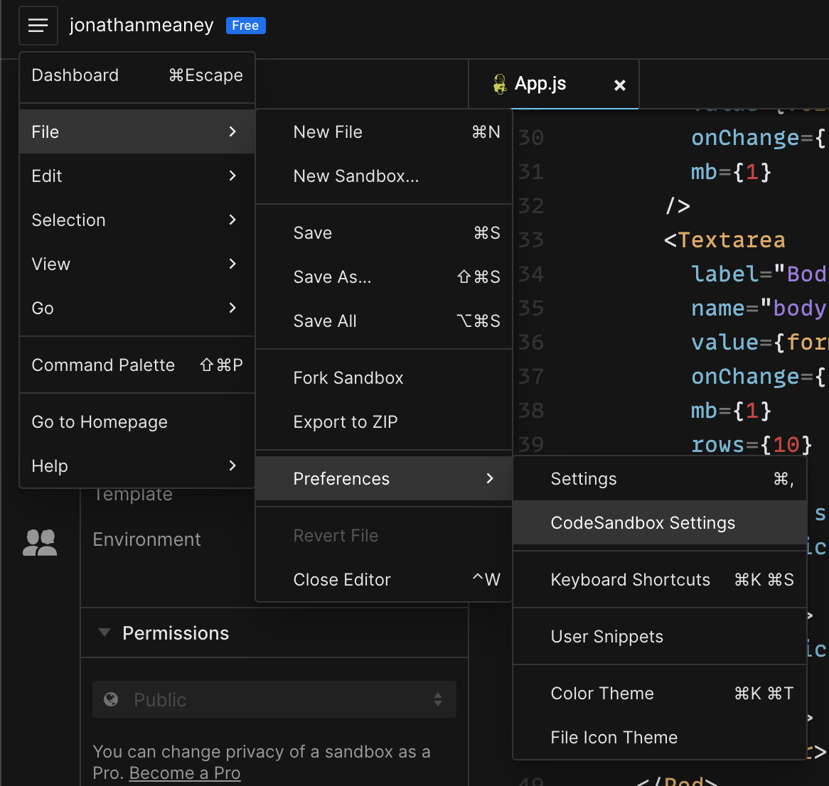
In the dialog that pops up switch off the Preview on edit option and then close the settings.

Now when you make changes to a file the preview won’t try to update constantly. It will just update when you save any changes.
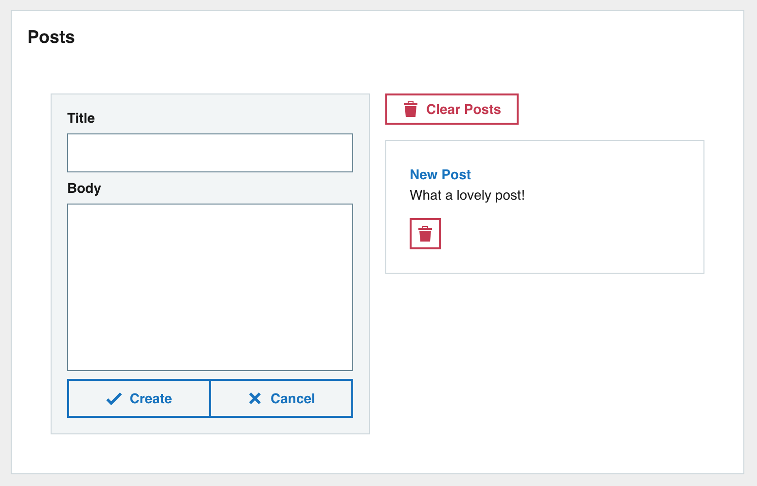
1.3 What will we make?
We are going to make a very basic Posts app with some basic CRUD features.
The screenshot below is what the end UI should look like.
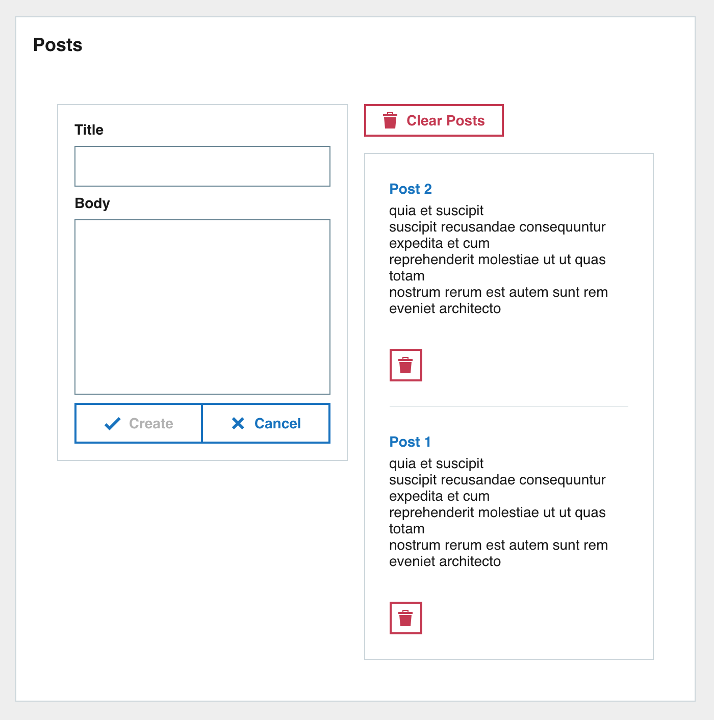
1.3.1 Breakdown
Lets take the screenshot of the final UI and break it down into its individual parts. This will make it easier to implement.

The outer Pod contains two columns. OThe left one with a Form and the right with the posts list.
We can break down the UI into the following tree:
> – Outer wrapper Pod > – Column 1 > – Post form > – Column 2 > – Clear posts button > – Posts list > – Post
2. Build app structure
The main structure of the app from the tree above is a main wrapper Pod with two columns for children.
2.1 Add the wrapper Pod
Lets start at the root of the tree. We need to create the wrapper pod for the app.
In App.js first import the Pod component from Carbon.
import Pod from "carbon-react/lib/components/pod";
And then add the Pod as a child of <div> and set the title prop of the Pod to be Posts.
import Pod from "carbon-react/lib/components/pod";

import "./styles.scss";

export default function App() {
  return (
    <div>

    </div>
  );
}
After making the code changes the preview pane in Codesandbox will update and you will see the empty Posts Pod.
2.2 Adding columns
The main content of the application is in two columns. Use the GridContainer and GridItem components to implement a two column layout.
import { GridContainer, GridItem } from "carbon-react/lib/components/grid";
The GridContainer component will contain the columns. We need two columns so there will be two GridItem components.
The gridColumn prop follows the CSS grid-column property and specifies the GridItem size and location within the the column.
A gridColumn prop value of 1/7 and 7/13 will create two equally wide columns.
Add the GridContainer with GridItem children to the Pod.
import Pod from "carbon-react/lib/components/pod";
import { GridContainer, GridItem } from "carbon-react/lib/components/grid";

import "./styles.scss";

export default function App() {
  return (
    <div>


    </div>
  );
}
The UI should now look like this. No major changes but the two columns are there now for use.

3. Build form
Now lets create the main component contained in the left column, the post form.
3.1 Form component
3.1.1 Form inputs
The form is composed of a titleless Pod wrapper containing a Textbox for post title and Textarea for post body. There are also form button controls for creating the post and clearing the form underneath the input controls.
First lets import the new Carbon components that we will be using.
import Textbox from "carbon-react/lib/components/textbox";
import Textarea from "carbon-react/lib/components/textarea";
import Button from "carbon-react/lib/components/button";
import ButtonBar from "carbon-react/lib/components/button-bar";
Create a Pod component with the variant prop set to secondary. This will give the Pod a different colour and make it stand out more.
Its first child will be a Textbox component with the title prop set to Title.
The second child is a Textarea component with the title prop set to Body. Textarea has prop rows which corresponds to the number of rows the Textarea will cover, set it to 10.
You can notice the mb prop used on both components. mb stands for margin bottom and sets a margin bottom value for the components. Most components support these props and there are versions all sides if needed.
Insert the Pod inside the first GridItem. This is the left column.
The code should look like this after inserting the Pod.
import Pod from "carbon-react/lib/components/pod";
import { GridContainer, GridItem } from "carbon-react/lib/components/grid";
import Textbox from "carbon-react/lib/components/textbox";
import Textarea from "carbon-react/lib/components/textarea";
import Button from "carbon-react/lib/components/button";
import ButtonBar from "carbon-react/lib/components/button-bar";

import "./styles.scss";

export default function App() {
  return (
    <div>


    </div>
  );
}
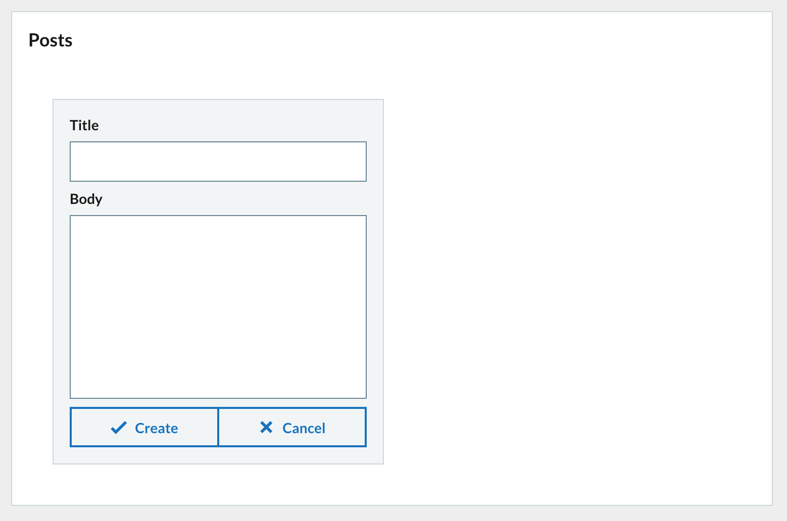
The UI preview will update in Codesandbox and you should see the new form inputs that you entered in the left column.

3.1.2 Form action buttons
The form has two action buttons. A Create button and a Cancel button.
The Create button will create a new post from the input data and the Cancel button will clear the contents of the form.
We will use the ButtonBar component (previously imported) to hold the two action buttons. The ButtonBar component groups Button components together nicely.
Create a new ButtonBar component and give it the fullWidth prop to make the bar and any buttons span the full width, also set the size prop to medium.
Add two Button components as children, one with Create text and the other Cancel. The Button component has an iconType prop which is the icon that will be displayed in the button. Use tick for the Create button and cross for the Cancel button.
  Create
  Cancel
Insert the ButtonBar under the Textbox and Textarea.
    Create
    Cancel
Your form should now look like this.
3.2 Form state
The form is in place but at the moment it doesn’t do anything. We need to connect the inputs with a data store. We will use the useState hook to create a state for the form to use.
First import the useState hook from the react package by adding the import tot the top of the file.
import React, { useState } from "react";
We will create a formData state. The inital value of the state is an object with blank title and body properties. This object will hold that state of the forms inputs.
The useState hook returns an array of values. The first value corresponds to the current state and the second value is the function used to update the state. Use array destructuring to assign the values. formData is the current state and setFormData is the function used to update the state.
const [formData, setFormData] = useState({ title: "", body: "" });
Add just after the component declaration.
export default function App() {
  const [formData, setFormData] = useState({ title: "", body: "" });
3.3 Connect form to state
3.3.1 Populate inputs from state
Now that we have the state set up for the form to use we need to connect everything together. The form inputs should display values retrieved from the formData state and changing an input should update the formData state accordingly.
Update the Textbox and Textarea components. Set the value prop to read the corresponding value from the formData state. This will populate the inputs with the current value from the state.
3.3.2 Update state on change
When one of the form inputs is changed we need to have an event handler function that will update the formData state. Create a new arrow function called updateFormData with e (event) as a parameter.
Add the function under where you added the formData state.
const updateFormData = (e) => {
  // destructure the name and value from the event target
  const { name, value } = e.target;

  // Call setFormData and update formData.
  // Creating a new object and using the spread syntax
  // to populate the object with the current contents of formData.
  // Then update the specific property name with the value from event.
  setFormData({
    ...formData,
    [name]: value
  });
};
The contents of the updateFormData function are a very common pattern you will come across.
Now that the event handler function is in place lets connect the inputs to it. Update the Textbox and Textarea setting the onChange prop to {updateFormData}. When the onChange event is triggered the updateFormData function will be called and an event object will be passed into it.
Now any time you make a change to either the Textbox or the Textarea the updateFormData function will be called. The input name and value will be taken from the event and the state will be updated accordingly.
3.4 Clear form
Lets create an easy way to clear the form from the cancel button.
Create a handler function to clear the form data when the cancel button is clicked. This simple function will call the setFormData function and update the state to its initial value. We don’t care about the event object this time so there is no needs to add it.
Add the function under the updateFormData function.
const clearFormData = () => {
  setFormData({ title: "", body: "" });
};
Then update the onClick prop of the cancel button to use clearFormData.
  Create

    Cancel
Now when you click on the cancel button the clearFormData function will be called and the formData state will be re-initialized.
3.5 Submit form
3.5.1 Posts state
We will need somewhere to put posts when we create them. This is another job for useState. We will use useState to create a posts state. This state will be an array of post objects so should be initialized with an empty array.
Add the posts state under the formData state near the top of the component.
const [posts, setPosts] = useState([]);
3.5.2 Add post to state
Now that we have state setup to hold posts we need a way to add posts to the array.
Create a new handler function called createPost under clearFormData. This function eventually will be called when the Create button in the form is clicked.
In the function create a newPost object and spread the contents of formData inside. Then add a new id property populated by the uuidv4() function. This will give the newPost object a unique ID.
We then need to add the newPost object to the posts state.
A feature of the setState function from useState allows you to pass in a function. This function will receive the previous state and you can use it in the function body.
In the arrow function return a new array with newPost prepended with the previous value spread after.
Finally clear the formData and call clearFormData.
const createPost = () => {
  // newPost object populated with title and body and
  // assigned a new ID
  const newPost = {
    ...formData,
    id: uuidv4()
  };

  // Pass in an arrow function to setPosts to get access to the
  // previous value of posts. Use this to prepend newPost
  // in a new array with previousState contents spread after.
  // The result is then set to the posts state.
  setPosts((previousState) => [newPost, ...previousState]);

  // Clear the inputs.
  clearFormData();
};
Import uuidv4 function from the uuid package for generating post IDs.
import { v4 as uuidv4 } from "uuid";
Update the Create button onClick prop with the createPost handler function. When the Create button is clicked then the createPost function is called and the new post will be added to the posts state.
    Create


    Cancel
3.5.3 Prevent creation of blank posts
At the moment you can click on the Create button whenever you want and create a new post, even if the inputs are empty. To prevent this we can disable the Create button using the disabled prop. If true then the Button will be disabled and clicking it will not create a `post.
We just want the Create button to be disabled if there are no values for title and body in the form.
Lets create a variable before the components return which will check if either of the formData fields are empty and return a boolean value.
// The create button should be disabled if title and body have no values
const createDisabled = !formData.title || !formData.body;
Set the disabled prop of the Create button to be the value of createDisabled.
Create
The Create button will now be disabled until there is a value for title and body in the form.
3.5.4 Check everything is working so far!
We now have a functional form and storage for posts but we can’t see anything yet. We can add in some logging to make sure that everything is working properly.
We will use another hook. The useEffect hook. This hook will run a function whenever a change has been made. It can be further refined to only run the function when specific changes happen. We will use useEffect to log the posts state to the console whenever the posts state changes.
First import useState from the react package similar to useState.
import React, { useState, useEffect } from "react";
Then underneath where you have formDate and posts state defined add a call to the useEffect hook. Pass in an arrow function just containing a console.table('posts', posts); statement. The second condition of the useEffect is the dependency array. Populate it with the posts state. This means that the arrow function will only be run on component first render and whenever the posts state changes.
useEffect(() => {
  console.table("posts", posts);
}, [posts]);
If you expand the Console tab in Codesandbox you will see the posts being logged.

Here is how our App.js file looks now after all the changes so far.
import React, { useState, useEffect } from "react";
import { v4 as uuidv4 } from "uuid";

import Pod from "carbon-react/lib/components/pod";
import { GridContainer, GridItem } from "carbon-react/lib/components/grid";
import Textbox from "carbon-react/lib/components/textbox";
import Textarea from "carbon-react/lib/components/textarea";
import Button from "carbon-react/lib/components/button";
import ButtonBar from "carbon-react/lib/components/button-bar";

import "./styles.scss";

export default function App() {
  const [formData, setFormData] = useState({ title: "", body: "" });
  const [posts, setPosts] = useState([]);

  useEffect(() => {
    console.table("posts", posts);
  }, [posts]);

  const updateFormData = (e) => {
    const { name, value } = e.target;

    setFormData({
      ...formData,
      [name]: value
    });
  };

  const clearFormData = () => {
    setFormData({ title: "", body: "" });
  };

  const createPost = () => {
    // newPost object populated with title and body and
    // assigned a new ID
    const newPost = {
      ...formData,
      id: uuidv4()
    };

    // Pass in an arrow function to setPosts to get access to the
    // previous value of posts. Use this to prepend newPost
    // in a new array with previousState contents spread after.
    // The result is then set to the posts state.
    setPosts((previousState) => [newPost, ...previousState]);

    // Clear the inputs.
    clearFormData();
  };

  // The create button should be disabled if title and body have no values
  const createDisabled = !formData.title || !formData.body;

  return (
    <div>


                  Create


                  Cancel


    </div>
  );
}
4. Post list
4.1 Create post list
Now that we have a working form and data storage we need a way to display any created posts.
Lets create a postsList function that will generate a list of posts for display. We will use the Tile component which displays items nicely with a divider inbetween.
Each post will be a new Content component. The Content component is good for displaying text data with help from Typeography.
First add the imports for the new components we want to use.
import Content from "carbon-react/lib/components/content";
import Typography from "carbon-react/lib/components/typography";
import Tile from "carbon-react/lib/components/tile";
Next add the definition for the postsList function under the createPost function.
const postsList = () => {

};
The first thing to do is to check if there are any posts in the posts state. If not then simply return No posts yet!. There is no need to continue if there are no posts to render.
const postsList = () => {
  // Handle there being no posts
  if (!posts.length) {
    return "No posts yet!";
  }
};
Next we need to handle when there are posts.
We will iterate the posts array using the map javascript function. Each iteration will return a new Content component representing the post.
Inside the map first use the Typography component to create a title for the post with variant prop strong and color set to primary.
Next create the return for the map. Populate with a Content component setting the title prop to be the title you just created. Set the key prop of the Content to be post.id. The map function returns an array and each React component in an array must have a unique key value. The child of the Content component will be post.body.
// Iterate the posts in the array and create a new array of
// Content components wrapping the post details
const list = posts.map((post) => {
  // Construct a title using the Typeography component
  const title = (

      {post.title}

  );

  return (

      <div>{post.body}</div>

  );
});
Finally after creating the array of Content components representing posts we need to add the return for the postsList function.
We need to return a Tile component with its orientation prop set to vertical. This will display the posts vertically. The child of the Tile component is the list of posts we created above.
// Return a Tile component with the list of posts content as child
return {list};
All together this is the final postsList function.
const postsList = () => {
  // Handle there being no posts
  if (!posts.length) {
    return "No posts yet!";
  }

  // Iterate the posts in the array and create a new array of
  // Content components wrapping the post details
  const list = posts.map((post) => {
    const title = (

        {post.title}

    );

    return (

        <div>{post.body}</div>

    );
  });

  // Return a Tile component with the list of posts content as child
  return {list};
};
Now all we need to do is call the postsList function. The postsList lives in the second column of out UI so thats where the function call will be. Update the second GridItem component and call the postsList function inside. This will render the posts list in the second column.
{postsList()}
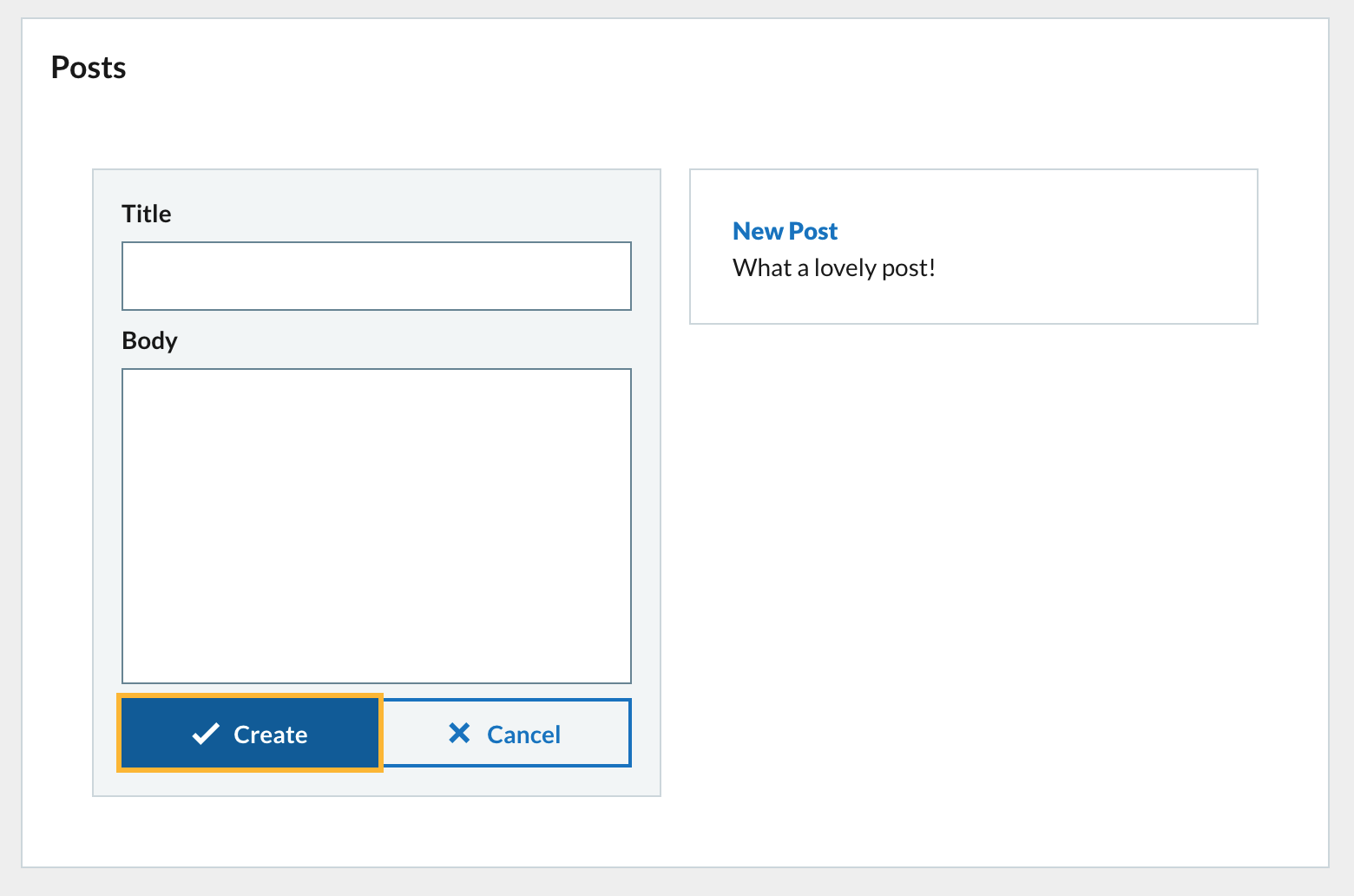
The preview in Codesandbox should have updated after your changes are saved. If you enter text into the form inputs and click on Create then the new post will be displayed in the posts list in the second column.
4.2 Delete post
Now that we have a list of posts we need a way to delete them. Each post has its own delete button according to the UI breakdown.
Lets add a deletePost function under createPost. The deletePost function accepts a post parameter, the post to delete.
The contents of the deletePost function will use call the setPosts state function and using the previousState method update the state to filter out the post passed into the function.
const deletePost = (post) => {
  // Filter the posts array and exclude the one passed to the function
  // Setting the posts array to be the new array
  setPosts((previousState) => previousState.filter((p) => p.id !== post.id));
};
Now we need to add a Button to call the function when clicked.
We need to update the postsList function to include the Button for each post.
Update the Content component and add another child Button. Set the destructive prop. Set the size prop to small and set the iconType to bin. This will display a red button containing a bin icon to denote delete.
Set the onClick prop to call the deletePost function. In order to pass a value to a function through an event hander then use an arrow function. Pass in the post object.
<div>{post.body}</div>
deletePost(post)}
/>
Clicking the button will now delete the post from the posts array.
5. Clear posts
We need another function that will clear the posts array. This will be called by clicking on a Clear Posts button.
Add the clearPosts function under the deletePost function. It is a very simple function. Just call the setPosts state function and pass in an empty array []. This will set the posts state to be an empty array and remove all the posts.
const clearPosts = () => {
  setPosts([]);
};
We only want the button to appear when there are posts to delete so update the return value of the postsList function.
Add another destructive Button with Clear Posts text. Set the onClick prop to the clearPosts function you created above.
return (


      Clear Posts

    {list}

);
Now when the button is clicked all posts will be removed.
And with all all of the UI from our original breakdown has been implemented.
6. Refactoring
6.1 Create Form component
Lets refactor all of the form functionality into its own Form component that we will use.
Add this to App.js for now, before the export default function App() declaration.
Create a Form component using arrow syntax.
const Form = () => {};
Then transfer all of our form components to the retrurn. We will need to add other data and functions for the Form as props.
You can use destructing directly on the props object passed into the component and pull out all items we need to use for the Form.
const Form = ({
  formData,
  updateFormData,
  createPost,
  createDisabled,
  clearFormData
}) => {
  return (


          Create


          Cancel


  );
};
Don’t forget to declare the Form.propTypes and Form.defaultProps after the component. Its important to do so for every component you create. The propTypes object lists the accepted props and what type of data to expect for it. The defaultProps object lets you define default values for props that may be missing.
Import the PropTypes package and define propTypes and defaultProps.
import PropTypes from "prop-types";
Form.propTypes = {
  formData: PropTypes.object,
  updateFormData: PropTypes.func,
  createPost: PropTypes.func,
  createDisabled: PropTypes.bool,
  clearFormData: PropTypes.func
};

Form.defaultProps = {
  formData: {},
  updateFormData: () => {},
  createPost: () => {},
  createDisabled: true,
  clearFormData: () => {}
};
Finally update the GridContainer and render the Form component in the left column. Pass in all the appropriate props.
{postsList()}
After adding the Form component all the functionality should be the same as before. There should be no difference.
7 Next steps
7.2 Move Form to own file
Now you can try move the Form component and any imports it needs to its own file in the system called form.js. Don’t forget to add a default export for Form in form.js.
Import Form from the new file into App.js and remove any unsed imports.
7.3 Create Post component
Next create a component for Post. This component represents a post from the posts array. The Post should have a title and body and have a delete button. The Post should look just like it does in the postsList function.
Follow the approach to the Form above.
7.4 Create PostList component
Next create a component for PostList. This component will render an array of Post components. The PostList will also have the Clear Posts button.
Follow the approach to the Form above.
> Notice that you need to pass functions from the main App component down to Post through the PostList. This is called prop drilling. We will look at solutions to this in a future workshop.
8. Finally
You can find the final code for the tutorial in the completed Codesandbox.
https://codesandbox.io/s/functional-components-intro-complete-b4lw6?file=/src/App.js.
 Jonathan Meaney
One thought on “Getting Started with Functional Components in Codesandbox”